A focus group was conducted with 7 students and shown the prototype and our ideas were presented. One of the objectives was to evaluate the dimensions the space and some of the feedback and comments are featured bellow.
Social
The social dimension of the space was achieved by creating an inviting, exciting, comfortable and attractive lower tier level. This space allows for users to relax and gather in groups or individually. It was felt by the focus group that the location though being a central point to much of the campus facilities on its own did not have a sense of purpose and the proposed i-Browse could be used as a meeting place and as a place “to hang out”.
Interaction
The interaction was tackled from two levels namely Interactivity with the system and Interactivity amongst humans.
The i-Browse system offers a one to one experience where users will interact with the holographic display by voice recognition software. Interactivity also exists between students and with the surrounding environment in the expandable and moveable seating and a Jenga game. Excitingly the system is also interactive with the environment adjusting the display on the roof and i-Browse system to show flames on a cold day and water feature on a warm day. This is enhanced with the corresponding under floor heating or fan system.
Interactivity amongst humans has played a major function with the design. Students felt that the space captures the mood created on the grass outside the church/ library on a hot summer’s day. Here the enclosed space puts people in close proximity allowing for them to relax comfortably and interact between groups and amongst groups. This was achieved through natural colours, a clear roof and soft comfortable seating right around the lower level. This is further heightened by the Jenga game.
The response of the group to the prototype received exciting support and recognised the overall impact which the space set out to achieve. It was showed that the space does not necessitate interactivity yet provides a stimulus/catalyst for interactivity between people.
Emotion
When asked to agree on words which reflected their impressions of the designed space they chose intriguing, exciting, unique, useful and well thought out.
Collaboration
Various ideas were suggested throughout the design cycle which could provide a collaborative dimension to the space. The previous suggestions were also put to the focus group and although it was felt that some of the other systems that were proposed such as the Graffiti wall gave a greater collaborative experience it was agreed that it was more suitable to have a longer lasting useful feature for the system other than a novelty idea which perhaps would have been experienced only a small number of times.
The space was however likened to something which you’d expect to see in a modern Silicon Valley office which has “funky chilled atmosphere which encourages creativity” and it was thought that the Jenga game gave students the chance to work together on something fun building teamwork.
Communication
Communication stems from both communications with the i-Browse system and amongst individuals. The group saw the holographic display as an enhancement that could show 3D visuals such as maps in a more effective way than 2D images. The close proximity in the lower tier and the adjustable seating arrangements was also seen to promote communication allowing for groups 2 sit together an all be heard.
Fun
The group saw the space as fun filled and a great contrast to the existing space although it was deemed that this did not appear the primary function but more of a supporting dimension.
Sunday, 13 January 2008
i-Browse software agent implementations
Development of software agent i-Browse:
An initial design session/thought shower enabled us to try out a number of designs and follow up various ideas/conceptions.
 We decided upon using an existing university symbol: the 'i' and creating a character based on the i symbol that can be customized by the individual users. The character can then be stored on their profiles so that every time they utilize the system their own character will appear. The default figure is an androgenous figure who expresses emotions through his eye brows. This also plays on the agents name, i.e. it is an 'i' and his purpose is to 'browse' the university intranet and internet. 'agent-i' is the default setting, which can be used by anybody. Students of the university however can change the profiles held on their student cards to personalize the agent character.
In the prototype stage agent-i was sculpted into the space to give us some idea of how users would utilize the agent and what his role was within the space.

Within the final computer prototype agent-i went digital and fully interactive. Here he can be seen assisting a student named Will to find the location of his interaction design lecture.

Design Phases/Re-evaluations
The design process went through a number of distinct phases/iterations that resulted in the final proposed interactive space. The process raised a number of design problems/dilemmas that forced us to re-evaluate how users would interact with the space.
Initial spatial prototype:
An initial spatial prototype helped us to designate areas within the space and understand how our proposed system would be incorporated into the surrounding area.

Second Spatial Prototype:
After various refinements a second prototype was produced, this time taking into consideration disabled access, colour schemes and overall housing units for the various areas. The ground floor is designated for the i-Browse system from which a ramp/walkway leads down to an interactive social area.

Initial i-Browse interface prototype:
The original i-Browse user interface consisted of a central unit at the ground floors central focal point. We decided that this went against our original concept of encouraging multiple users to utilize the space and interact with each other.

Secondary i-Browse implementation:
Multiple units are position around the outside of the central space with seating positioned for its users. After consideration we decided that this too contradicted with our initial conceptual models of the space. The space had lost its focal point which did not seem like an appropriate replacement of the original space.

Final i-Browse interface prototype:
A central Kiosk housing four i-Browse units bring users together around a unified focal point encouraging users to interact with both the interface and other users. The primary seating space is designated on the lower floor. The area now reaches a compromise between public and private space. The dividers between the central units respects the individual users privacy whilst maintaining a central focus for the public space.

With the interface prototype complete it can be incorporated into the overall space complete with roof and seating areas:

Design Process
Our design process was based on the following model, created by Dix (2004):
 We included five fundamental stages in the process:
1. Requirements
Through the use of questionnaires (see benchmarking section) we attempted to ascertain users’ current perceptions of the space and what they would like to see in the future.
2. Analysis
We then analysed the results of the questionnaire and identified the key concepts and issues relating to the space and what could potentially be seen in the future.
3. Design
Once the key concepts were highlighted we then set about the design process, generating various ideas based on what the users would like to see the space used for.
4. Iteration and Prototyping
This was possibly the most lengthy phase of the design process, as we came up with a variety of prototypes (see design phases section) and adjusted these through various cycles, based on their evaluation and re-evlaiuation.
5. Implementation and Deployment
The final design! Once this was agreed we completed the final prototype for presenting.
Source: Dix, A., Finlay, J., Abowd, G.D. and Beale, R. (2004): Human-Computer Interaction. Third Edition. London: Prentice Hall Publishers
Additional Theoretical Design Issues
In addition to the consideration of Norman's principals of effective design, we referred to Schneiderman's eight golden rules for interface design, specifically concerning the "i-browse" information hub:
1. Consistency
The action sequence and layout of the "i-Browse" i-agent is very simple, with only three limited fundamental actions so as not to confuse the user. These consist of the question state, an answer state and a confused state, for when the user has requested information which the i-agent does not understand.
Similarly the command use of the i-agent is very simplistic, with basic terminology being used in order to active the hub, direct it and close session.
These features in turn, create a consistent, easy to understand and learnable interface for the user.
2. Shortcuts for frequent users
As the i-agent will be intuitive, it will recognize returning users and make suggestions based on their previous usage, namely short-cuts to frequently access information and suggestions for further points of interest. This will in turn generate efficient usage and increase the likelihood of users returning to the system.
3. Feedback
With the i-agent resembling human form, formative feedback will be clearly visibly and audible to the user, via the use of the three actions mentioned above.
4. Closure dialogues
Again, as the i-agent resembles human form, the closure dialogues informing the user when they have completed a task, will be clear.
5. Error prevention and handling
Error prevention has been taken into account via constraining the choices of the user by making all actions of, interactions with and feedback mechanisms for the i-agent clear and visible to the user.
6. Easy reversal of actions
This also links to error prevention mechanisms above. However, i-agent has been designed so that the user can undo any action they have made and/or return to the home screen via a simple command.
7. Internal control mechanisms
While the i-agent is an intuitive system, the user maintains control at all times and has the ability to select and deselect the level of information they require.
8. Keeping displays simple
This again links to consistency above and has been explained.
Source: Dix, A., Finlay, J., Abowd, G.D. and Beale, R. (2004): Human-Computer Interaction. Third Edition. London: Prentice Hall Publishers
Saturday, 12 January 2008
Design & Implementation issues
Design considerations & Issues:
Lack of system complexity: The system has to be able to be learnt without the user perceiving the system to be too complex. The users must be able to form a conceptual modal of what they think the system should do. The user must be able to map between what they think would happen and what would actually happen.
As suggested by Donald Norman in "The Design of Everyday things"
"Visibility indicates the mapping between intended actions and actual operations"
Another important principle suggested by D. Norman is the affect of affordance on the user.
It is important within the design of the space that we do not mislead the user and that actions preform the required tasks.
The importance of the systems ability to be understood and provide usable information: The agent has to be understandable to all users even if they are visually impaired, hearing impaired and or speak another language. The system must be able to adapt to the users who is currently using the hub,whether they adapt to the disability or the language the option must be available.
Vandalism: An issue considered is the materials used and how users will precise the objects and materials used. A particular concern was the Hub, the hub will be made of clear glass/ or some form of durable plastic but this will lead the opportunity for people who wish to vandalise the space to graffiti the hub. There is no foreseeable way to prevent this from occurring at the moment.
Safety: Safety and providing a safe environment to the users is an important factor to the design of the space, due to the space being on two levels there have been various design additions that will help ensure the safety of the users. For example, Safety rails, ramps, warning signs (Visual), warning signals (Audio), and different types of surface (i.e surfaces used for the visually impaired to indicate raised or lowered surfaces)
Evaluation
(1) Usability,
(2) Accessibility,
(3) Learnability,
(4) Fun,
(5) Usefulness,
The group decided that a focus group session would be the best option to address aspects and extract ideas from the participants regarding the interactive space.
We gathered 7 people varying in degrees & Levels from the Student populous.
The Focus groups environment was situated in the UCLANS Preston Library, all members where contacted via email to meet first at the praying hands memorial. Participants where asked to think about the space they where in and talk in a group about their thoughts. The Warp Team did not focus on what was said by the members of the focus group but used the time go get the participants familiar with the context and the environment of the design space.
After that we conducted the rest of the focus group in the experiment area within the UCLAN Library as stated earlier.
The prototype was set up in the centre of the room (on a table) The participating group was informed of the concept and was asked the following prompting questions,
(1) "How usable do you think the prototype is?"
(2) "Do you consider the space to be accessible?"
(3) "How easy/hard do you think it is to learn the system and retain that knowledge?"
(4) "Is the space fun and inviting? / Would you stay there with your friends?"
(5) "How useful is the "i-Browse" concept, would it be a success?"
In response to Question (1):
Users considered the concept of the space to be very usable. The concept appealed to the participants. The users stated that they can look at the system and understand how it is used (Suggesting the formation of a conceptual mental modal of the spaces functionality).
In response to Question (2):
One of the participants stated the accessibility for users with disabilities and there ability to access the spaces design features without limiting an individuals experiences regardless of their inabilities.
The main accessibility issues raised where as follows,
- Visually impaired/ Blind Users
- Hearing Impaired/ Deaf Users
- Motor Impaired (Wheel chair users) Users
Visually Impaired and or Blind Users: This issue was solved due to the technology used with the site, the "i-Browse" systems functionality enables the agent to read relevant i.d cards, thus the i.d card containing relevant information i.e information regarding a persons disability. For this example the Blind, the system would react (direct feedback) by using more expressive terminology and higher sounds. Also areas such as the stair area users who are visually impaired or blind will have flooring indications and hand rails.
Hearing Impaired/ Deaf Users: It was considered the Hearing impaired experience will not be hindered in the site due to the agent being able to provide visual output.
Motor Impaired (Wheel chair users) Users: Certain facilities have been added to the site to ensure that no users of the site has a lesser experience of the site. There will be a ramp provided (built into the steps) and the chair sand the hub can be retracted if needed.
In response to Question (3):
The users considered the system to be self explanatory and previous skills and/or knowledge is not required, the system is voice activated, and no buttons have to be pressed to preform functions.
In response to Question (4):
Participants considered the space to be fun and inviting and they would enjoy interacting and socialising within that space, the understood and welcome the premise of promoting interaction, collaboration and communication. They hoped that the space would be implemented in the future.
In response to Question (5):
Participants considered the concept of an interactive agent and the "i-Browse" to be an innovative idea that aided in providing users with information. They enjoyed the idea that the agent would be fully interactive and helped them with tasks such as checking time tables and looking for cinema listings.
Storyboard Example
Below is a basic example of the functionality of the prototype.


(1) David receives a phone call from his friend James. James tells David to meet him at the "i Browse" at 12:00pm. David agrees. David checks his watch and sees that it is 11:45am, so he sets off to the "i Browse"
(2) David arrives 10Min's early so he goes over to the "i Browse hub", the "i agent" activates as he sits down at one of the empty spaces at the hub. He asks the "i Browse" to provide him with the cinema listings for the local Cinema
(3) "i agent" displays the results in the palm of his hand,David finds the film, which he selects by asking the i agent to display times for the film he wants to watch. i agent displays the times. David stands up and walks away, the i agent deactivates.
(4) David still has 5minutes to wait so he goes and sits down in the seating area in one of the comfy chairs provided, he sends a text to his friend telling him where he is.
Where we stand in the design Process?
Currently the Design of "The Interactive Space - i Browse, i Agent" is focused more towards the Role of the space and how the space will look and feel.
- The "Role" of the space is important to achieving the goals set at the beginning of this project, making sure we achieve a space that is focused on providing an interactive solution that promote communication and interaction between students and the community.
- The "Look & Feel" of the space is important to show the principals of how we would achieve the requirements of the space, an important factor of the interactive space is to provide a safe comfortable area that enables users to interact and communicate. How we determine the Look & Feel of the area is essential to how we portray what we are promoting.
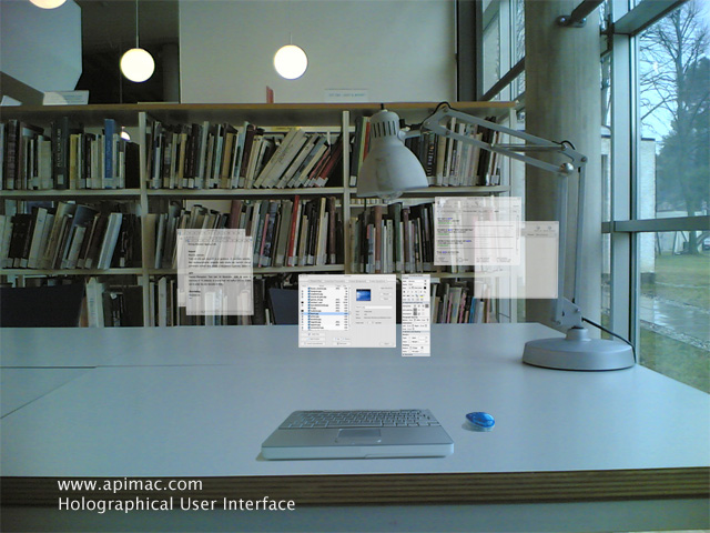
Fig 1 shows i diagram example:
(Fig 1)

Friday, 11 January 2008
Benchmarking
The below questionnaire was generated in order to gauge the response of the previously identified stakeholders as to their opinions on the space. The results were as follows:
- Most people were not aware of the significance of the praying hands and did not know what the space was used for.
- A low number of people used the space directly, with most using it as a through fare.
- Most people felt the space was not being used to its full potential.
- Participants indicated the space could be improved through the addition of a shelter with seating area and a more friendly, community driven atmosphere.
- Most people would not object to carrying more personal information on their student cards if it meant a more personalised service.
Benchmarking
Gender: Male Female
Yes No
Do you know what the space is currently being used for? Yes No If so please state:
Thursday, 10 January 2008
Initial Conceptual Ideas
Interactive wall space (focusing on touch screen technologies) that promotes Communication via a help forum board. Users post digital "Post it notes" with a question they require help on. i.e "How hot is it in Greece?" - then... Another user would post a "Post it Note reply" to that specific question or post one of their own dependent on what they want to do. The user would be able to select colours, pen size, type of font, and if they want to add pictures. Questions asked would be contained in their own hierarchical Structure with multiple sub questions (quires) and answers all displayed on the interactive wall space at the "Hands"
William Carter
The chosen overall concept was to create a space which appealed to the target audience and key stakeholders. The ideas generated are aimed at capturing imagination, usability, comfort and interaction amongst pears. As well as a central point providing a specific purpose, the space around it will provide suitable usable surroundings enhancing the experience for the user. The desire is to create a partially enclosed space which mimics the emotion displayed by students sitting on grass on a hot summer’s day. It is deemed through observation and participation that a positive emotion is displayed whereby the comfort and relaxation brings about a greater sense of interactivity amongst groups of students and also between groups of students.
The following idea was proposed:
Holographic interactive fountain/game
This would be the inspiring focal point of the space generating campus wide interest and provoke discussion and interaction amongst key stakeholders both in and away from the actual space.
The holographic interactive game should be one which could be collaborative such a Jenga. The display could appear in a box type screen with touch sensors corresponding to the image displayed. The game could also be rotated periodically or could be chosen from a selection.
The hologram would also when not in direct use consist of a flaming/water fountain dependant on the weather. On cold day the hologram will show a flame generating a warm feeling of the space and on a hot day the watery fountain display will create a cooling sensation.
Seating
The warm and cooling features could be enhanced through an under floor/seated heating and cooling system. Around the central holographic display and to the edge of the space soft cushion type flooring would be used. It is hoped that padded flooring will both allow for people to pass through the space but also once on there would encourage the person to sit down and relax.
Roofing
It was thought that the best way to encapsulate the desired effect of relaxation and comfort thus provoking interactivity amongst people was to partially enclose the space and create a roof. This would be a contemporary non flat design and could be used to further emit the display of the fountain, i.e. Flames or waterfall effect.
Screen
A large projection screen placed on the cat building can provide an outlet to display work from across various departments. Departments can use it to showcase new developments and students work. Short films, animations and still images can also be shown. This also opens up a media outlet which could raise funds for the upkeep of the project through advertising.
Arron Harrison
Richard Hamer
UCLan WikiBox
A unit is placed in the space that allows users to find information out about all aspects affecting the university and surrounding area. Like a traditional wiki the content is user generated allowing a bottom-up approach to ascribing content with its context/meaning. Entries can be edited and debated and it is hoped that such a system would encourage a collaborative learning/publishing environment to develop within the university and local community.
Paul Rowe
Existing Technology
In order to understand how our system will be implemented it is important to understand the current available technology and whether the designs are feasible in a real world scenario.
Internet Kiosks
 Internet Kiosks are the closest example of an analogue to the i-browse software agent. Such a system is already implemented around UCLan in the form of the i-stops which provide access to the University Intranet. The main difference between them and our proposed system is that the i-browse provides a more intuitive user interface having the capacity to be personalized to the individual users. It also proposes a greater use of metadata to increase its functionality within the University Intranet and the wider community.
RFID Tags

RFID Tags are becoming more and more prevalent within ICT and society in general. i-browse makes extensive use of RFID Tags to create a personalized user experience. However the use of storing sensitive data and in the use of RFID Tags in general raises many ethical and security issues.
Holographic Interfaces
Holographic interfaces have yet to be fully realized although there are many companies who are coming close to implementing them. This would be an ideal technology for our i-browse software agent as it promises vandal proof technology in public spaces. Whilst this would be the ideal the i-browse service could function just as well within a traditional screen GUI environment.
Motion Sensors + Input Devices

I-browse would ideally utilize an advanced input device including voice recognition, retina scanning, facial recognition etc. This would create a more intuitive and adaptable user experience and has the capacity to increase the overall accessibility of the i-browse system. However with more limited means basic motion sensor technology could be employed to create pseudo artificial intelligence with a reactive user interface.
Internet Kiosks
Internet Kiosks are the closest example of an analogue to the i-browse software agent. Such a system is already implemented around UCLan in the form of the i-stops which provide access to the University Intranet. The main difference between them and our proposed system is that the i-browse provides a more intuitive user interface having the capacity to be personalized to the individual users. It also proposes a greater use of metadata to increase its functionality within the University Intranet and the wider community.RFID Tags
RFID Tags are becoming more and more prevalent within ICT and society in general. i-browse makes extensive use of RFID Tags to create a personalized user experience. However the use of storing sensitive data and in the use of RFID Tags in general raises many ethical and security issues.
Holographic Interfaces
Holographic interfaces have yet to be fully realized although there are many companies who are coming close to implementing them. This would be an ideal technology for our i-browse software agent as it promises vandal proof technology in public spaces. Whilst this would be the ideal the i-browse service could function just as well within a traditional screen GUI environment.
Motion Sensors + Input Devices
I-browse would ideally utilize an advanced input device including voice recognition, retina scanning, facial recognition etc. This would create a more intuitive and adaptable user experience and has the capacity to increase the overall accessibility of the i-browse system. However with more limited means basic motion sensor technology could be employed to create pseudo artificial intelligence with a reactive user interface.
Prototyping
Initial Interface Prototype
An initial draft of the user interface was created to help understand how users would interact with the software agent that forms the focal point of the space.

After various design phases a cubicle design enabling four users to use the i-browse simultaneously was decided upon. This was a compromise between having a focal point whilst maintaining the privacy of the individual users.
 When users enter the cubicle zone an RFID tag installed in their student cards would identify the user to the software agent and load their personal settings. Users could also specify the level of information disclosed to the software agent and even choose to disable the agents access and just use the default i-browse agent.
When the user steps inside the cubicle the i-browse agent springs to life, ideally a hologram but could also work using conventional screens. In this instance the user is late for his lesson and doesn't know which room his class is in. i-browse utilizing the student profile held on the RFID Tag communicates with an advanced database system and automatically brings up a map displaying the students classroom and the directions on how to get there. Ideally such a system would be able to access a range of composable services on the University Intranet making the above scenario just one of many functions the i-browse could be used for.
Tuesday, 8 January 2008
Methodologies
The Following is a list of the methodologies that will be implemented into the design and prototyping/ evaluation of the interaction design project. Hopefully the methodologies will aid the group in providing a prototype that meets our requirements.
(1) Wizard of OZ: To facilitate prototyping interventions that have not yet been implemented into the functionality of the design
(2) Observational: To monitor the users as they use the prototype, to allow us to make required changes and preform at least 1 iteration of the design cycle
(3) Retro-Spective: To film a prototyping session, which shows basic functionality of the space
(4) Co - Discovery: To allow uses to collaborate together to see if the design promotes the ability for the to create a conceptual modal enabling them to use the space.
(5) Inquiry: To ask questions that will aid us in redesign. i.e. how they felt, what they liked, would they use it again.
Prototyping
The image in fig 1 shows an image of the prototype design centred around the interactive space. The first image is a basic representation of the roofing that will house all the interactive objects inside.
The second image shows a conceptual idea of how the interactive hub will look like.
(Fig 1)

Sunday, 6 January 2008
Context Exploration
The idea is to create a concept that utilises a space, that promotes interaction within a given context. Being; the praying hand memorial situated next to the CAT building within UCLANs Preston Site.
How will we enhance the space to facilitate the communication between students?
The site is used within many contexts, the first being the most important is the site acts as a Social gathering point, many students use this as a meeting place. The site has two benches which people use to sit down and have a chat with their peers or have something to eat.
The environment has not been effectively used as a lot of the space is void of any materials and free from objects. It is not a very appealing place too stay around too long.
The space is not used to its full potential which is a shame. With the right concept the space could house an interesting emotion filled space that captures the essene of what we are trying to achieve. Users would be happy/ happier to spend more time there.
Students who have been spoken to do not think the site fulfils its potential and would be happy for a new concept to be introduced.
The main issue is how the space is uninviting and lacks soul. A concept needs to be derived that utilises the space to make it a unique focal point in UCLAN where students would like to come and stay for a while and be in an atmosphere and an environment that is exciting and creative whilst looking towards the future.
The context is looking at a space that lacks modernisation in a community that is shaping the future, we only have the CAT & Media building that focuses on current up to date technology.
The site has to be designed towards the future and move towards more innovative technologies that facilitate communication between not just the students but the community.
Friday, 4 January 2008
Evaluation Plan
Context Definition;
An interactive space that utilises a holographic personification of a person, using Software Agent and A.I. technologies, that promotes collaboration between students/ Community. The agent will be an interactive focal point that enables people to come and gather in an relaxing environment.
Goals & Outcomes;
Goal: To determine user behaviour
Outcome: to understand user behaviour
Goal: To see if target group makes uses of the new interactive space
Outcome: Users participating in the area
Goal: To assess the spaces area to promote/ develop collaboration and communication between participants
Outcome: To see how the users communicate and collaborate in the space
Goal: To see if the target group benefits from the development of the space
Outcome: Idea of how the space is beneficial to users
Aspects to be Evaluated;
(1) Whether the interactive product enhances the space while promoting collaboration & communication between users.
(2) Whether the interactive product meets the ideas/ concepts i.e. is the space relaxing, does it provide what we intended it too?
(3) Whether the users can understand the concept of the idea.
Participants;
A varied demographic of the student community
Location;
A controlled environment at the hands / lab controlled environment
Tasks;
Whether users can utilise the prototype made available.
Methods;
Wizard of Oz
Observational
Retro perspective
Co Discovery
Inquiry
Design Review - Other Products
The idea is to review other designs and ascertain how they proceeded in their own design process.
The GOCCIA: Domus Academy; Summer Session 2007 Design for electronic Tools, Experience and gesture; "The Goccia" Project leaders, Claudio Moderini & Silvio Cioni.
http://projects.domusacademy.net/te/goccia/index.html.
The GOCCIA: Domus Academy; Summer Session 2007 Design for electronic Tools, Experience and gesture; "The Goccia" Project leaders, Claudio Moderini & Silvio Cioni.
http://projects.domusacademy.net/te/goccia/index.html.

The Goccia uses a contextual top level approach by brainstorming keywords relevant to the concept such as "presence, and keeping in touch" A premise of the Goccia is to "Share information continuously in informal ways".
The Goccia design concept uses pictures of relevant current/already on the market to portray the services the Goccia will use such as "Walkie Talkie, mobile, PDA, and Flickr"
They also show graphical representations of how the Goccia will be used, a representation of the main premise of the gestures.
The Concept generation utilises storyboards and sketch's of the Goccia inaction and how it will be used.
The prototype show the final product and gives an idea of the market product, there is a detailed diagram pointing out the features of the product and a brief description of the products functions.
It makes use of stating the materials and colours that would be used within the product, it gives the user a visual representation of that they would see and feel.
Several slides of the presentation show the device in action and shows its multiple functionality and its innovative design.
It makes detailed noted on how the Goccia will be interactive and provides the key features of the interaction.
The use of persona and scenarios is apparent and is used coincide with "real life" pictures of the Goccia working in the real world.
The Goccia design approach is very interesting and its dimensions are very similar to the type of concept (ideas) that we as a group are trying to achieve. The steps taken by the Goccia work extremely well and i believe it show the idea in a well rounded way to the audience. The Goccia approach is a good point of reference for a good design.
William Carter.
Electroland Interactive Walkway (Fort Lauderdale, Florida 2005)
http://http//electroland.net/flash.php
Electroland is a company focusing on the usage of technology to enhance experiences in public spaces. Its Interactive Walkways project features a glass pedestrian bridge with a field of LED lights embedded in resilient walking surfaces. Sensors detect the presence of people and the system triggers interactive light patterns on the walkway floor.
The project is very much user orientated, with the aim of using technology to connect people with their surroundings and other users of the space. Although the technology exists to implement the project, and there does exist basic implementations of the design (see site), the project is very much conceptual. The challenge is to develop what appears on the surface as a gimmick (i.e. light show) into a more of a functional and interactive experience.
One such development could be to implement RFID data into the design. This would allow the installation to adapt to the personal setting of its users. It could even introduce the various users to one another, or if you are in a hurry you could choose not to interact with the space.
There is also a safety critical aspect to the design. Is the cost of adoption worth the benefits i.e. does the interactive aspect of the design jeopardize the structural integrity of the bridge?
This project raises many issues that can be incorporated into the group design. This is due to the fact that the Interactive Walkway is dealing with a similar, environment orientated, design scenario, which asks the question: How do you make an existing space more interactive to its users?
Paul Rowe.
Momento: Domus Academy; Summer Session 2007 Design for electronic Tools, Experience and gesture; "Momento" Project leaders, Claudio Moderini & Silvio Cioni. http://projects.domusacademy.net/te/momento/index.html
 The Concept
“Momento” is a mobile device used for enhancing social relations. Taking the form of a compass, “Momento” is in short a social networking tool which “navigates you through life”, enabling the user to make new friends on the move and keep in touch with existing ones, no matter where they are in the world. Features include the ability to perform messaging, gain internet access and audio and video file sharing. The information then received/stored on “Momento” can then be transferred to various social networking services.
Design Process Brief
The design brief for “Momento” was to create, “A personal tool for capturing and sharing the daily experiences and for creating a personal content-based blog/broadcast. An integrated media environment and a publishing platform for content hunting, filtering and aggregation: a dynamic personal mediasphere”
The Design Process
The design process for “Momento” consited of the following stages:
1. Problem setting
2. Concept generation
3. Mid review
4. Concept development
5. Presentation
The concept generation and development stages involved the design team initially researching a variety inputting tools and mechanisms available and widely used today, such as touch screen computers, digital voice recorders, a compass, satellite navigation etc. Brainstorming was used to generate this information, with the utilisation of a picture collage to display the thought process.
From here numerous sketches and diagrams were produced by the team, considering a multitude of concepts and platforms.
The final concept was then agreed and a feature diagram was created in order to demonstrate “Momento’s” device functionality, systems and services and format/display.
Finally a storyboard was created in order to produce a “real-life” simulation of “Momento’s” application in various settings. Scenarios were utilised to illustrate how the user would interact with the system.
Conclusion
The design process applied in the development of “Momento” serves as a useful guide on how to approach this project. The use of scenario, storyboarding and the generation of a feature diagram are particularly useful aspects which could be employed during our design process. One additional point that may be of use is the “mid review” stage mentioned. This could prove to be a valuable step in the process, specifically in terms of iterative design.
Richard Hamer
Group Scenario
Group Scenario: "i Browse Site" - "i Agent".
Joanne is a 20 year old drama student originally from Essex, recently moved to Preston to study at UCLAN. She has a limited amount of experience with computing technologies.
Joanne is looking for a part time job after spending all her student loan. She is wondering whether her dramatic skills are transferable into a job role in her local area. She visits the “I Browse”, that replaced the praying hands memorial in 2008. She enters the “I Browse” hub at which point the “I agent” (a holographic anthropomorphic personification of a person) activates due to her close proximity, she sees 3 other people in the hubs cubicles next to her, each accesses their own individual version of the "i agent". The “I agent” tries to access her personalised profile, dependent on reading her student identification card. The system notifies Joanna that “I browse” cannot access her profile without her identification card, unless she knows her personal identification number and password located on her identification card, which she doesnt. The Agent still offer to assist in any general enquires that she may have. She leaves the hub and goes to do some shopping, on returning home she find her identification card which reminds her of the experience at the “I Browse” site. So she decides to come back to the “I browse” site with her card and try again. Joanna steps back into the hub and the “I agent” reads her identification card and accesses her personalised account.
Joanna asks the “I agent” to find local jobs based on her profile, the Agent cross reverences her profile with the database of local jobs from the Bridge job centre. The results are displayed in the palm of the “I agents” hand. She can access relevant data by selecting the required results.
Concept Selection
After completing various stages in the design cycle, the group finally reached a concencous regarding the concept.


"A.I. holographic Software Agent that provides information to students"
Based on this concept, the group produced two thought showering Maps, detailing the Agents functionalty and Design,
Concept Map 1:
Concept Map 2:
Inidvidual Scenario
The group created individual scenarios related to their thought showering maps, it was hoped that in completing this process a concept will be found that all members of the group liked, enabling us as a group to proceed onto the next step in the design cycle.
Individual Scenario 1
Asifa is a 3rd year Muslim Student who commutes to University 3 days a week for lectures.
It is a warm spring day and Asifa and her friends have an hour before their next lecture and want somewhere to go to relax and enjoy the weather, David is tired and would prefer to rest on the grass he knows he burns easily. Lucy recommends Source bar beer garden but Asifa would prefer to suggest somewhere other then the bar.
They decide to go to the ray of light, and each is able to do varying things within close proximity. Asifa and Oliver are feeling lively and interact with the holographic images. David sits by them but falls asleep on the cushions and chairs provided in the space. Lucy and Rachel decide to sit in the open section of the light and find themselves chatting to the boys to the left of them.
Before they realise the hour has passed. Asifa and Oliver stop for a second to admire their work and rallies the troops. David wakes up feeling much better after his nap in the light. Rachel exchanges numbers with the boys she was talking too and leaves for lecture.
Arron Harrison
Individual Scenario 2
Jim is the head of marketing for the student union at UCLAN. He wants to advertise the bridge job centre in the students union to new student who may not be aware of the facility. Usually it is advertised though a blanket email campaign however Jim wants to make the experience more interactive to individual students. Jim uses the new interactive hands to post current job vacancies.
Students walking through the space can use the space to find jobs relevant to their CV. Jim plans to use the space to advertise future events planned by the student union tailed by the student’s individual profile. This uses the database contained within the new interactive hands space to cross reference with an advanced database which cross references student’s profiles with current job opportunities.
Paul Rowe
Individual Scenario 3
Chen is an 18 year old student from China and has just enrolled on the BA (Hons) Business Studies at UCLan. He has never been to the UK before but has a fairly high standard of English and has passed his IELTS level 6 (a prerequisite for international students wishing to study for a UK Undergraduate degree). Chen chose to study in the UK as he saw it as the perfect opportunity to broaden his experience and further develop his English skills. UCLan was his first choice of institution due to its high reputation back home in China and so by studying here he would increase his career prospects quite considerably.
It is a Saturday morning and Chen has just finished his first week at UCLan. He has already made a couple of friends and has explored the campus, so feels pretty optimistic about his future here. Some of Chen’s friends from his home town in China have also come to England to study and are based at Manchester Metropolitan University. Chen has arranged to go and meet up with them today and see how they are settling in. Also with it being his first time away from home it would be nice to see a familiar face.
The only problem is, due to the excitement of the previous week (enrolment, paying fees, induction lectures, settling into halls of residence etc.) Chen forgot to ask one of the ‘Buddies’ (international student advisors at the University) how get to Manchester from Preston and the University was now closed, with it being Saturday. Chen, therefore, asks his flat mates if they can help and they inform him that there is a train station nearby but are unsure of the timetable. Just then Chen has a brain wave. He remembers that during his induction tour of the University he was shown a student electronic information point, located near the Computing and Technology building. He didn’t really pay much attention to the specifics of how it worked because there was a lot to take in that week, but he figures this has got to be his best chance of finding out how to get to Manchester, and so he sets off for the information point.
On arrival at the Computing and Technology building Chen approaches the information point. An instruction is written on the screen which says, “touch screen to activate”, in a variety of languages, including Chinese. Chen does as instructed and a welcome message appears, prompting him to select a language. Although Chen has a decent standard of English and normally enjoys testing out his language skills, he is in somewhat of a rush and so decides to select Chinese. Once he does this a menu appears giving him a variety of information options, including ‘events on the surrounding area’, ‘university timetables’, ‘university opening hours’ etc. Chen is unsure which menu to select but notices a search field on the top of the screen so selects this. Upon doing so a touch keypad appears and so he enters the word “trains to Manchester” in Chinese and presses the “ok” prompt also present on the screen. The screen then generates another menu with a list of various options, one of these being “train times from Preston to Manchester.” Chen selects this option, using the touch screen and is then prompted to choose the time of travel. Chen selects the option for the “next available train” and a list of times appear for trains travelling to Manchester, from Preston, over the next couple of hours. “Brilliant!” Chen thinks. There is a train in the next hour, which leaves him with more than enough time to get to the train station. However, there is just one small additional problem; he doesn’t know where the train station is. Therefore, before Chen leaves the information point he uses the “back” button prompt on the touch screen to return to his previous search results and browses through the remaining options. Sure enough at the top of the list, is the option for “directions to Preston train station”. Chen presses this option and a map appears on screen, directing him to the station from that exact spot. Chen is very pleased. He now has all the information he needs to make his journey. Finally, before Chen leaves the information point, he selects the “exit session” button on screen and it closes down, by displaying the message, “thank you for using the student information point, goodbye.” Chen then sets off on his journey.
Richard Hamer
Individual Scenario 4
David is 19 years old, he is completing a degree in computing and has a high knowledge of technology including computers. He has been informed by his friend Mark that Mark and his other friend James will be late and that they should meet him at the WALL. The WALL is the new interactive hub that replaced the praying hands memorial. They all agree to meet at this well known public/ student location. David arrives at the WALL and takes a seat under the sheltered area where he sees a group of students chatting, David begins to read the graffiti written on the wall, the wall is made of clear glass. The graffiti is not of public defecation but a feature of the WALL that users are able to interact with the WALL and post their own graffiti tag.
David stands up and walks over to the interactive control panel which senses him in proximity and activates the available features. He selects his text font and colour and writes a message on the interactive wall, he then access the paint feature using his finger he goes on to draw a picture. He then posts the image to the WALL. The wall does not allow him to post the image as the content is not appropriate, this being one of the security features within the WALL, (image recognition) he edits his images and resubmits. His friends finally arrive and they sit down together and chat.
William Carter
Group Concept Thought Showering Map
Ideas where pooled together to form the Group Throught Showering MAp, the map is made up of ideas related to the individual maps thought to be of most importance when generating new ideas/ concepts.

Group Thought Showering:
Thought Showering
The group decided to each produce a Thought Showering Map containing individual concept ideas. After the individual ideas where collated a Group Thought Showering Map would be produced.
Individual Thought Shower 1
 Individual Thought Shower 2
 Individual Thought Shower 3
Individual Thought Shower 4

Subscribe to:
Posts (Atom)